UI Design - Creation of a mobile application
2020
During my year of Bachelor Web Design and Graphic Communication, I had the opportunity to follow UI Design courses. For the second semester, I had the mission to create my own mobile application by following several steps :
- Define the theme and the target of the application.
- Create a story mapping
- Create wireframes
- Create graphic models
- Define the theme and the target of the application.
- Create a story mapping
- Create wireframes
- Create graphic models
Being passionate about music, I wanted to create an application that fits me. That's why I had the idea to create my own music streaming platform called "Lumen Music" in order to showcase artists that I like to listen to and that are different from the music industry market because of their creativity.
Therefore, I wanted my application to be unlike any other music platform. So I voluntarily put a personalization system as well as the possibility to buy directly on the application CDs, vinyls, concert tickets of the artists.
As for the design, I wanted a dark design so that the user can use it all day without tiring his eyes. Moreover, I found that using a dark design was more trendy than a light design. I added 3D keys to increase the feeling of immersion.
UX Design - Analysis of the Bang & Olufsen website
2019
Also, during my year of Bachelor Web Design and Graphic Communication, I had the advantage of having UX Design classes.
Indeed, during this course, I had to analyze a website of our choice from a user point of view. I chose to analyze the Bang & Olufsen website because it is a brand that has always interested me by its innovative products, but also by its high-end and elegant design.
Indeed, during this course, I had to analyze a website of our choice from a user point of view. I chose to analyze the Bang & Olufsen website because it is a brand that has always interested me by its innovative products, but also by its high-end and elegant design.
So I had to analyze the header, the navigation, the homepage, the product list, the purchase path and the reassurance.
In conclusion, I found many positive points such as:
- The icons are clear and there are not many. According to the magic number of Miller our storage and processing capacity of the elements are 7, so the site is not overloaded and we can remember the icons well.
- The icons are clear and there are not many. According to the magic number of Miller our storage and processing capacity of the elements are 7, so the site is not overloaded and we can remember the icons well.
- The page loading time is short, which has a good impact on the user's loyalty, but also on the overall efficiency of our site.
- The different "call-to-actions" are strategically placed and have a different color to differentiate from other buttons and encourage purchase.
- The site is responsive, which means that it adapts to all types of media. This is important because 1/4 of all purchases are made on a mobile device.
- The links on the pages have a good affordance because they are readable and clickable.
On the other hand, I found one point that could be improved : When the user goes to his personal account, it is impossible to return to the home page by clicking on "Bang & Olufsen".
But also a critical point : There are no pictures of the people who created the company, who are in the stores or even those who answer the phone. The user does not know who he is in contact with and therefore has the impression of being in contact with robots.
But also a critical point : There are no pictures of the people who created the company, who are in the stores or even those who answer the phone. The user does not know who he is in contact with and therefore has the impression of being in contact with robots.
Commercial Relationship - Analysis of Stylist Magazine
2018 - 2019
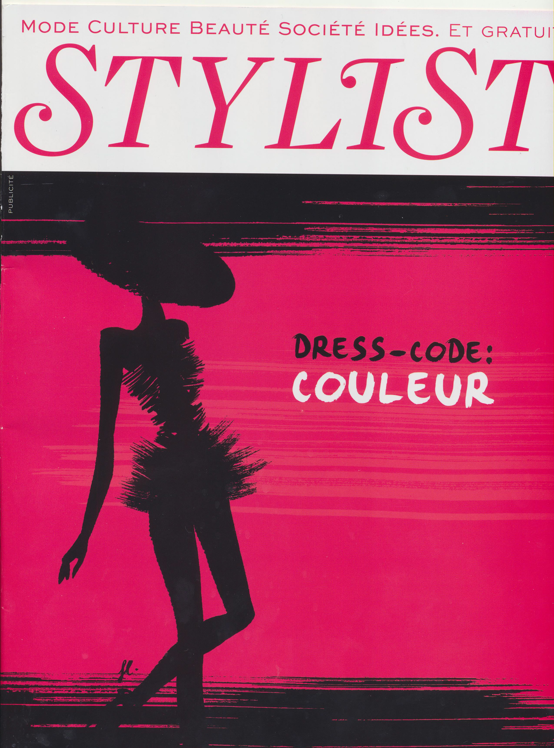
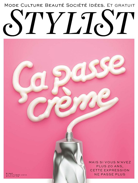
As part of my business relations course during my two years of BTS Communication, I was tasked with analyzing Stylist magazine as a Junior Advertising Manager in the commercial department of GMC Media.
As a group, we had to do a readership study, an analysis of the advertiser portfolio, a creation of a sales pitch, an elaboration of the prospecting plan, a new-business operation and a loyalty program in order to increase the magazine’s notoriety.
As a group, we had to do a readership study, an analysis of the advertiser portfolio, a creation of a sales pitch, an elaboration of the prospecting plan, a new-business operation and a loyalty program in order to increase the magazine’s notoriety.
